Parcel
Oct 2024
Designing a Financial Ecosystem for Web3 Organizations
When I joined Parcel to lead the design efforts, we were riddled with user suggestions and features on our roadmap that were important but would evolve into product/tech debt a few months down the line. We took a step back and built something from the ground up that made our life easier and also helped users build healthier financial workflows.
The Problem
Existing crypto payment tools, including Parcel at that time, were doubling down on a generic payment process. It usually only required a CSV with the amounts and wallet addresses. Although this approach was quick, it broke down in practice as over time. Our biggest problems were:
A fully unified experience (processing bills, reimbursements, and payroll in one transaction) made it difficult for teams to coordinate and grow.
Poor metadata made financial data harder to trust and act on, leaving accountants frustrated.
We were pre-revenue and must find our footing in a market crowded with free tools.
Our Approach
Parcel was like a Swiss-army knife, people could use it for any type of bulk transaction. Among all the ways people used the service, we identified payroll, reimbursements, and bill payments to be the champion use cases we could build for. We compartmentalized those workflows and built a bookkeeping tool to turn Parcel into an ecosystem.
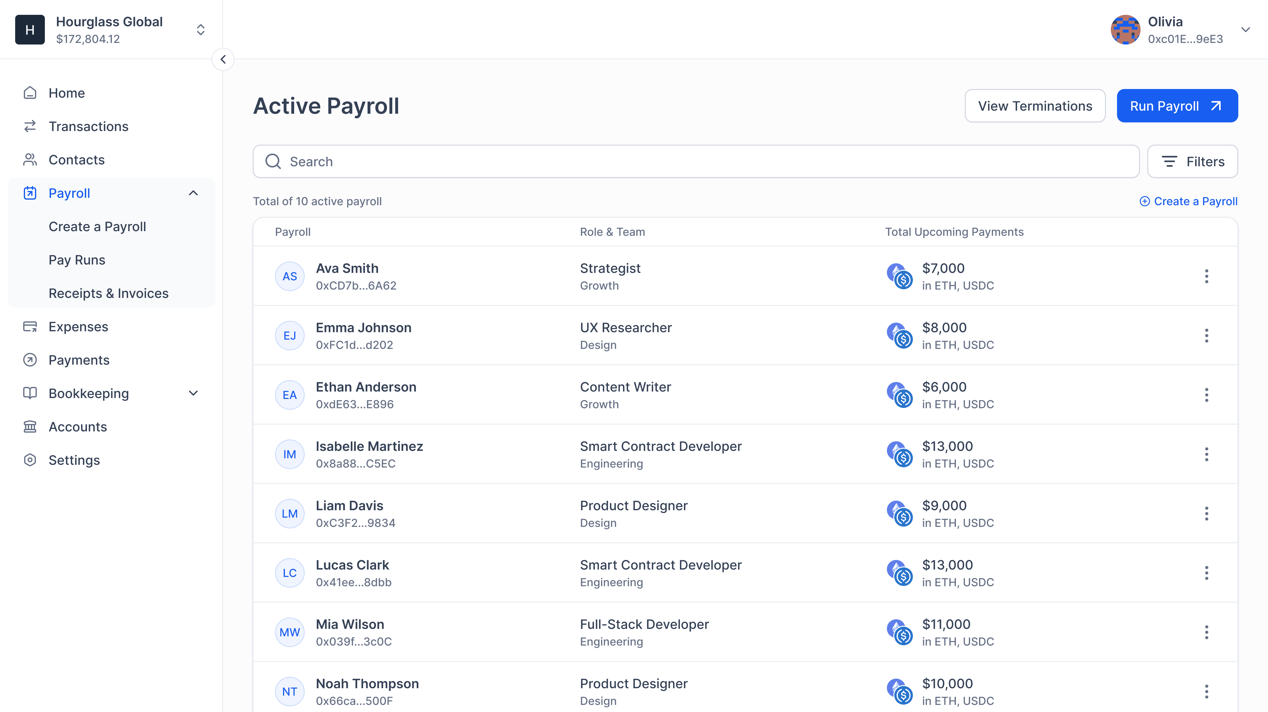
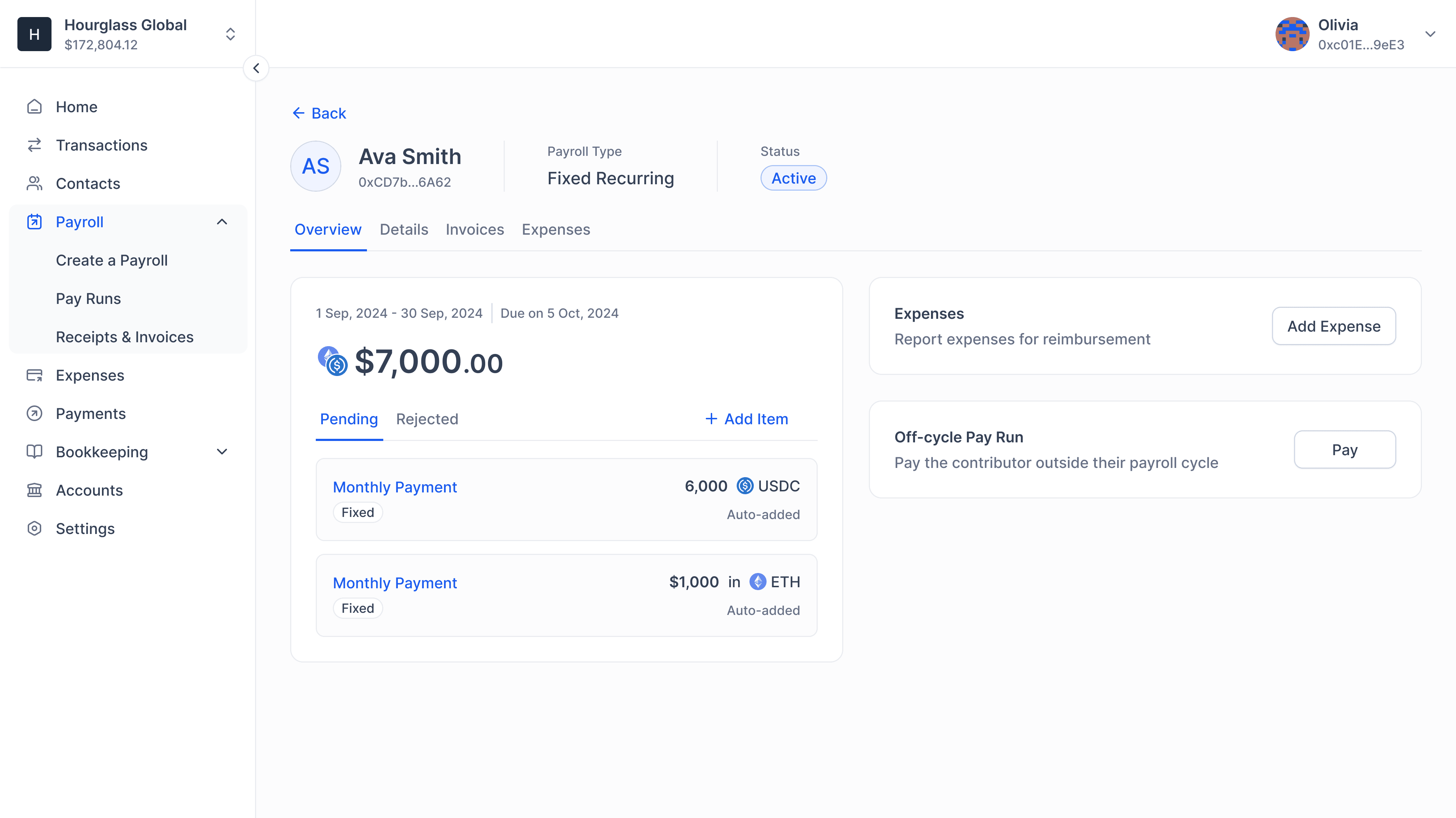
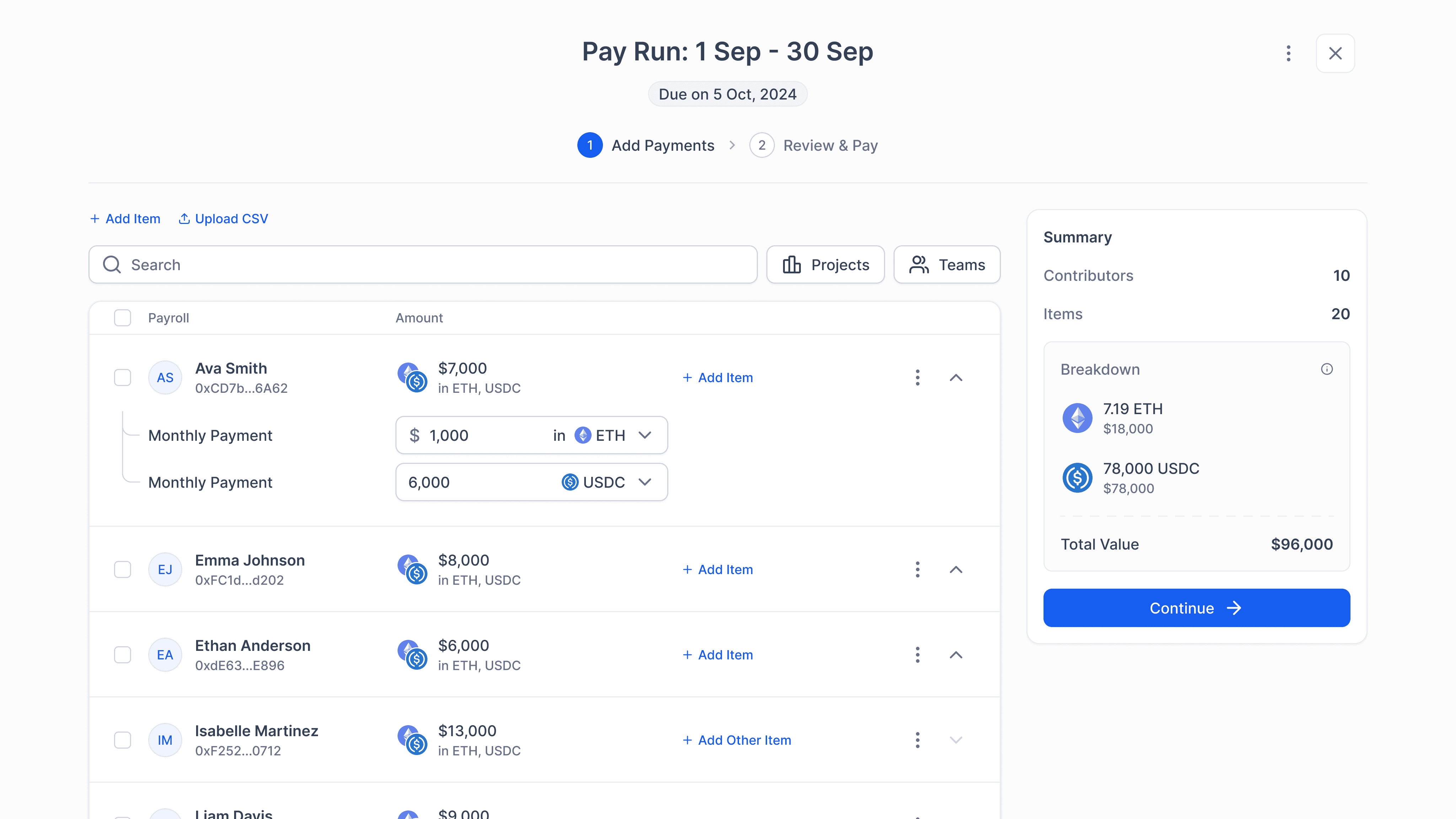
Flexible Payroll System
Web3 organizations usually compensated their contributors in their native tokens but we built a system that allowed users to maintain salaries in multiple tokens, which ended up becoming the more common approach by mid-2023.
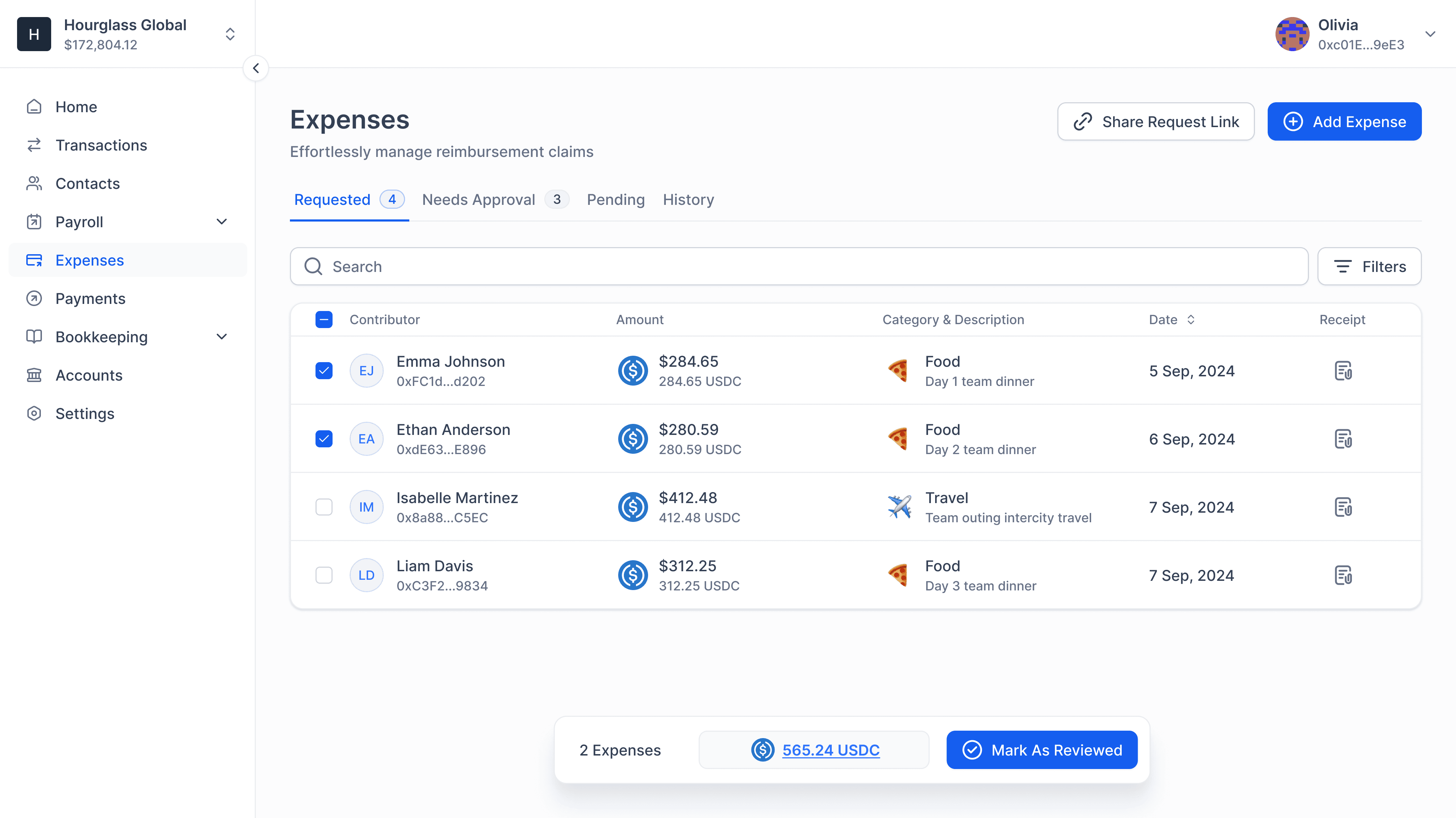
Transparent Reimbursements
The industry was getting used to contributors submitting their claims via Google forms and the operators reviewing them on Google Sheets to finalize the payout CSV. We built a system where contributors could submit expenses on the app and monitor their statuses, including amendments.
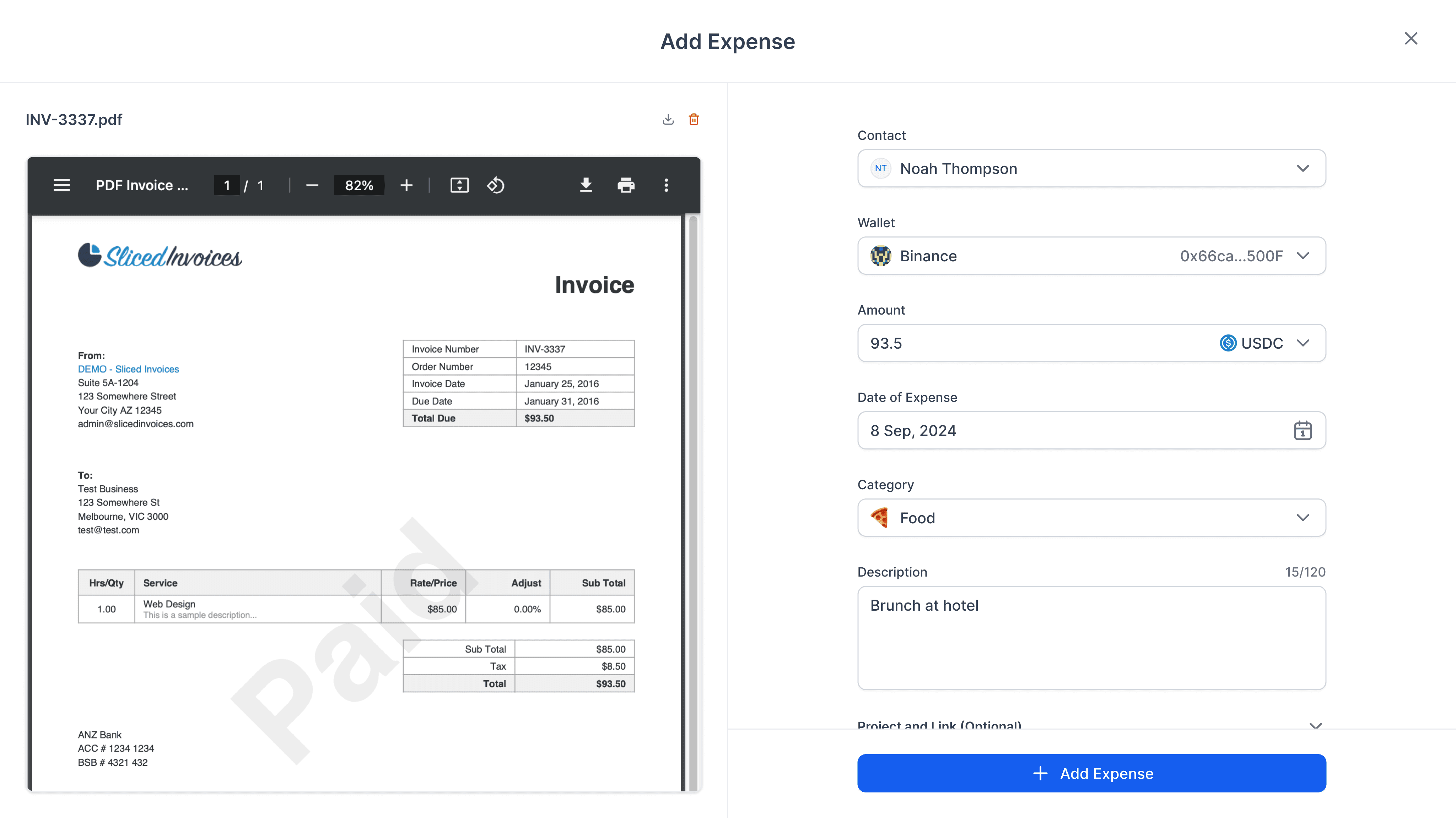
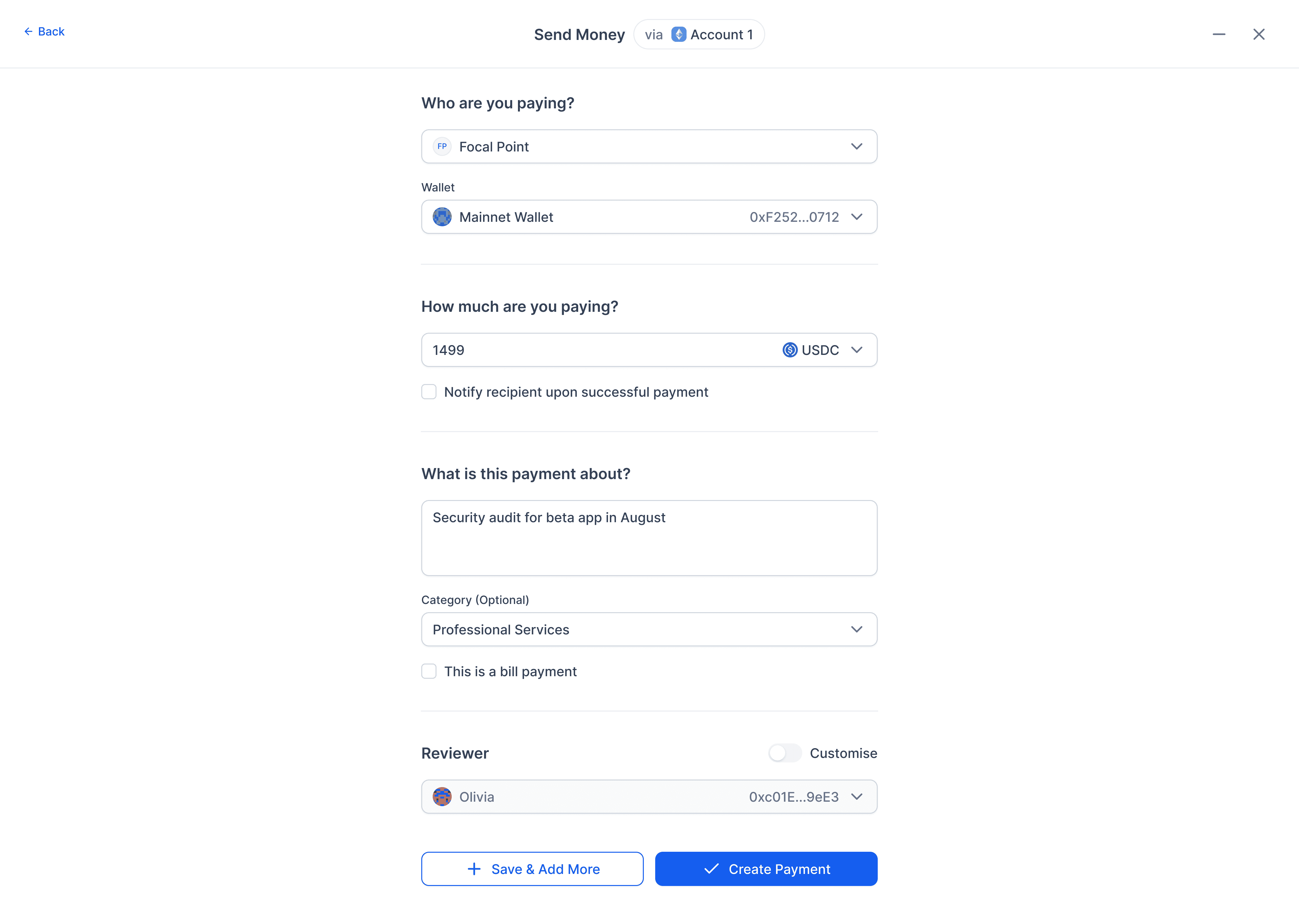
Bill Payments for Speed
A seamless bill payments system designed for teams that move fast. We supported rich metadata and work closely with out customers to make invisible UX choices that saved hours every week.
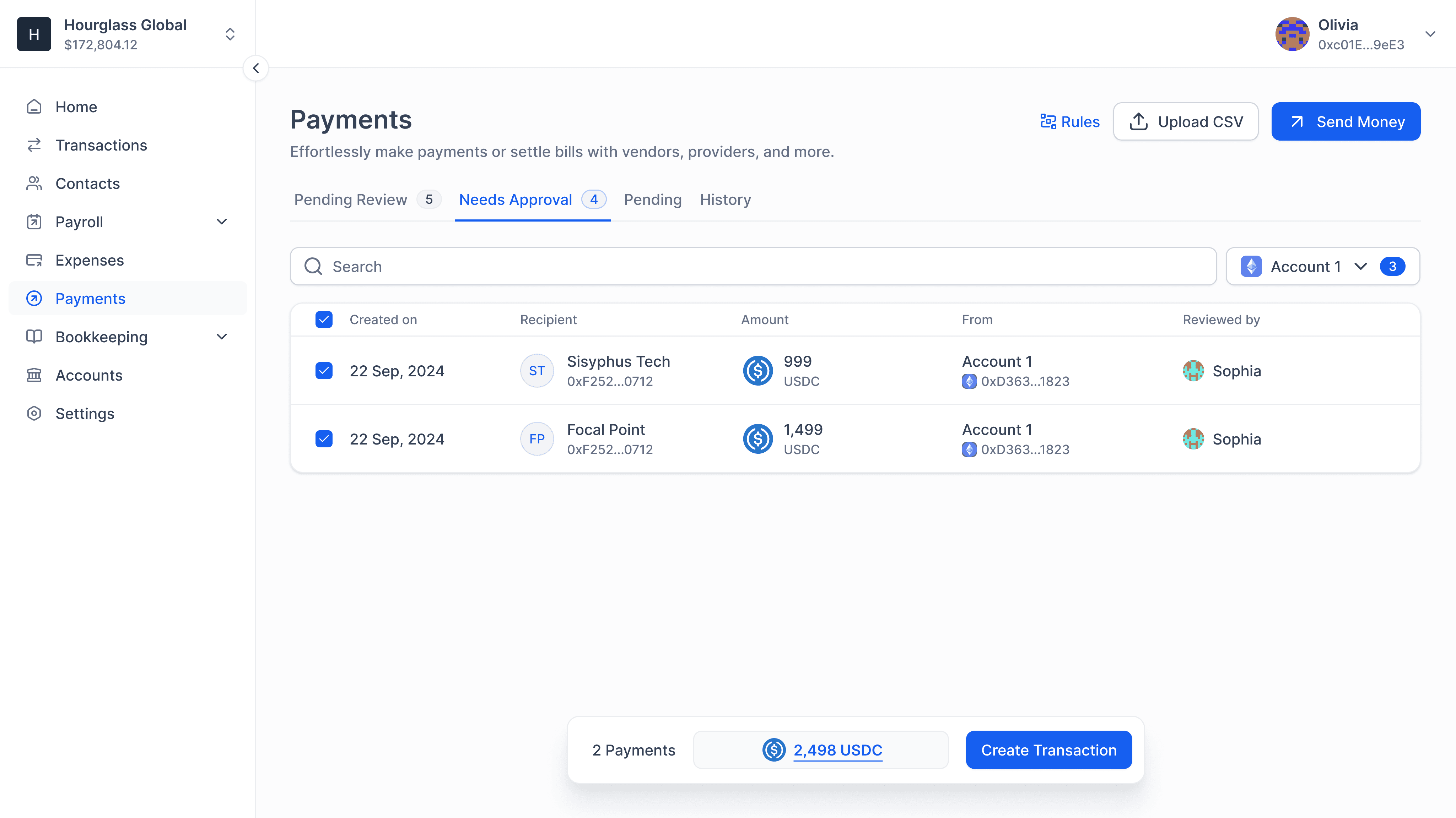
Unified Core Experience
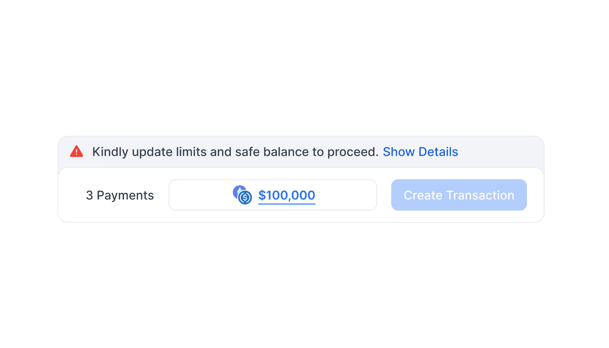
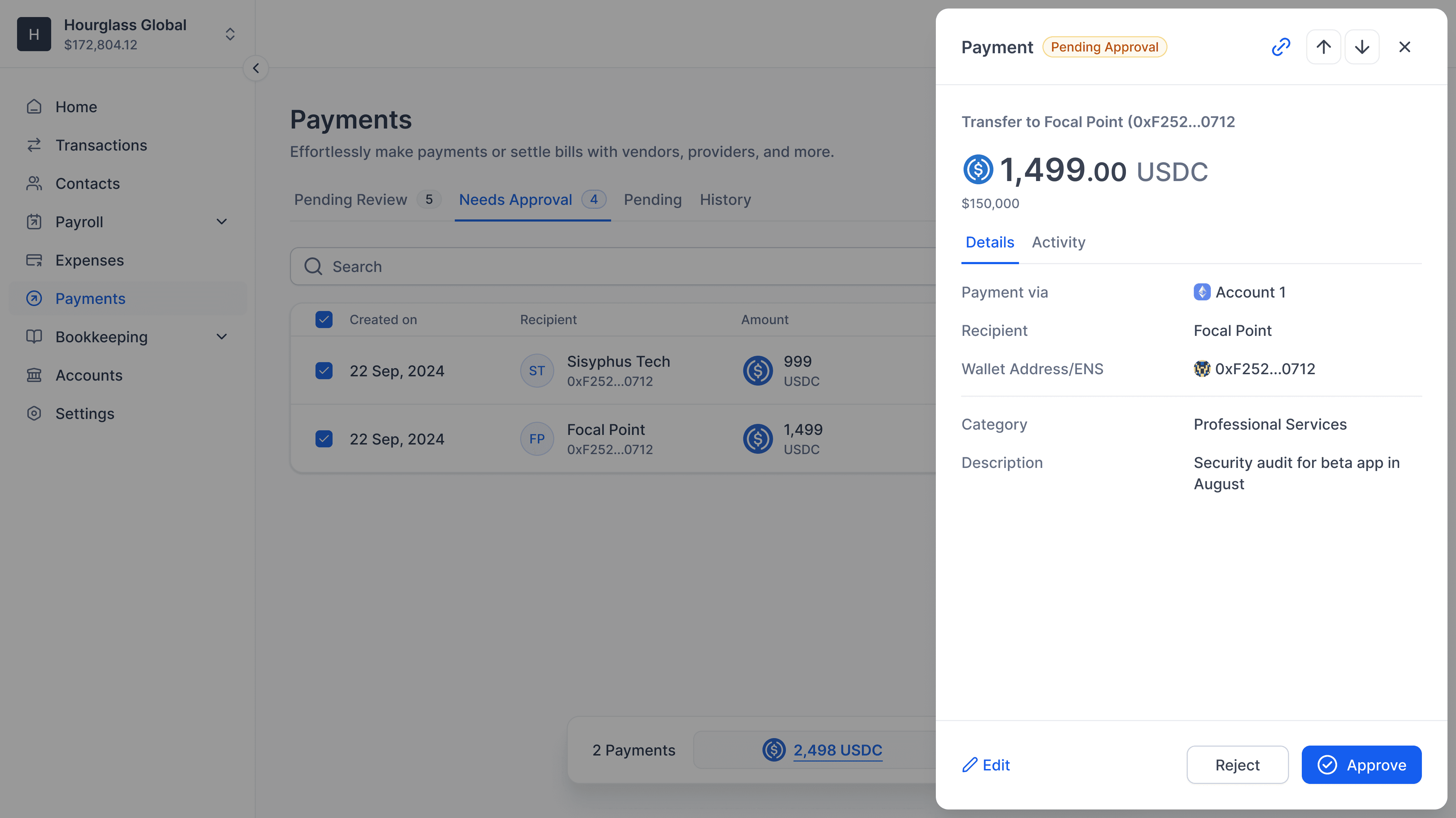
Although each module is compartmentalized, reviewed transactions from them are queued up in one place for final signatures and execution. Parcel was built on top of SAFE, which meant we had to execute transactions sequentially.
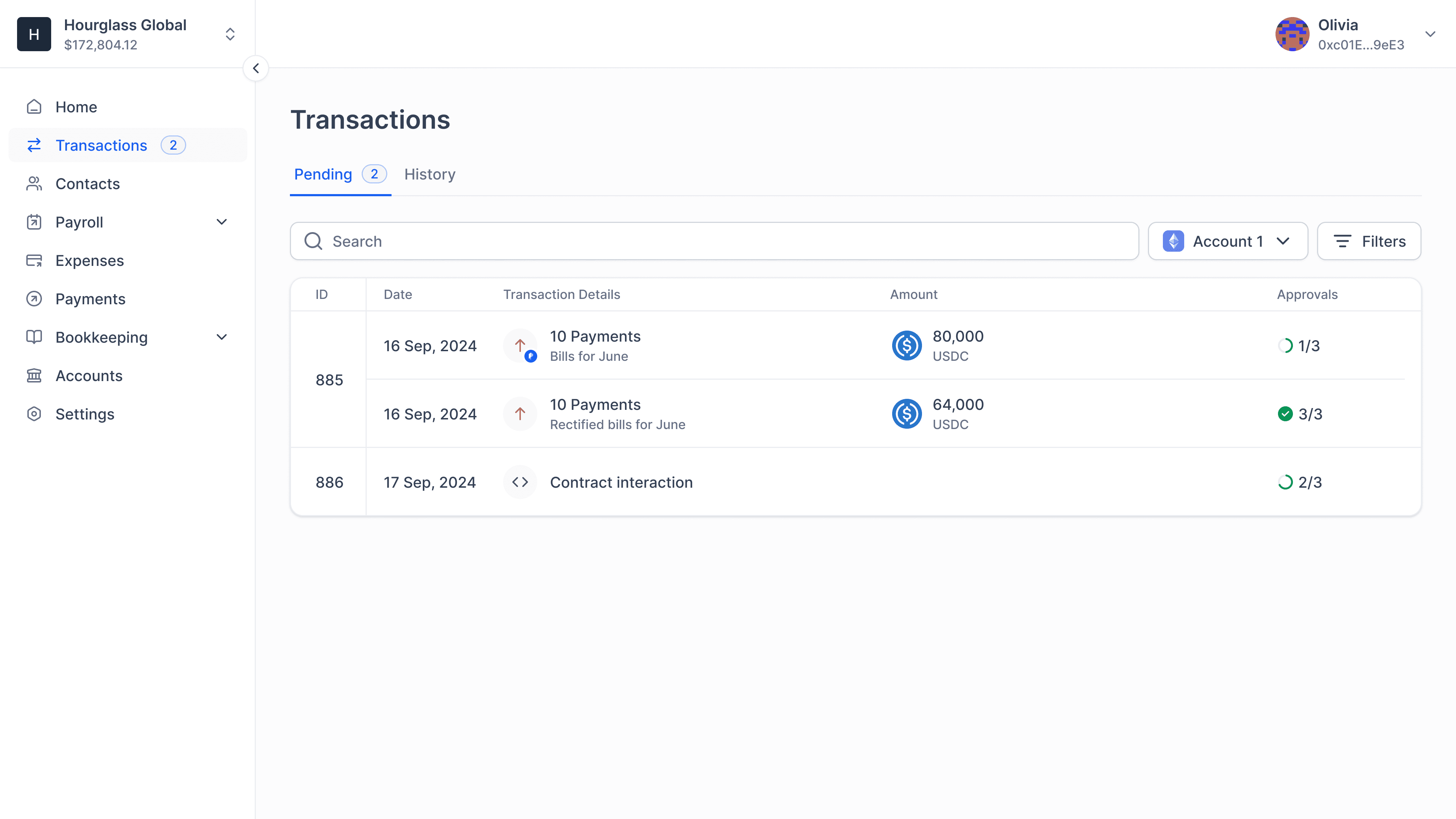
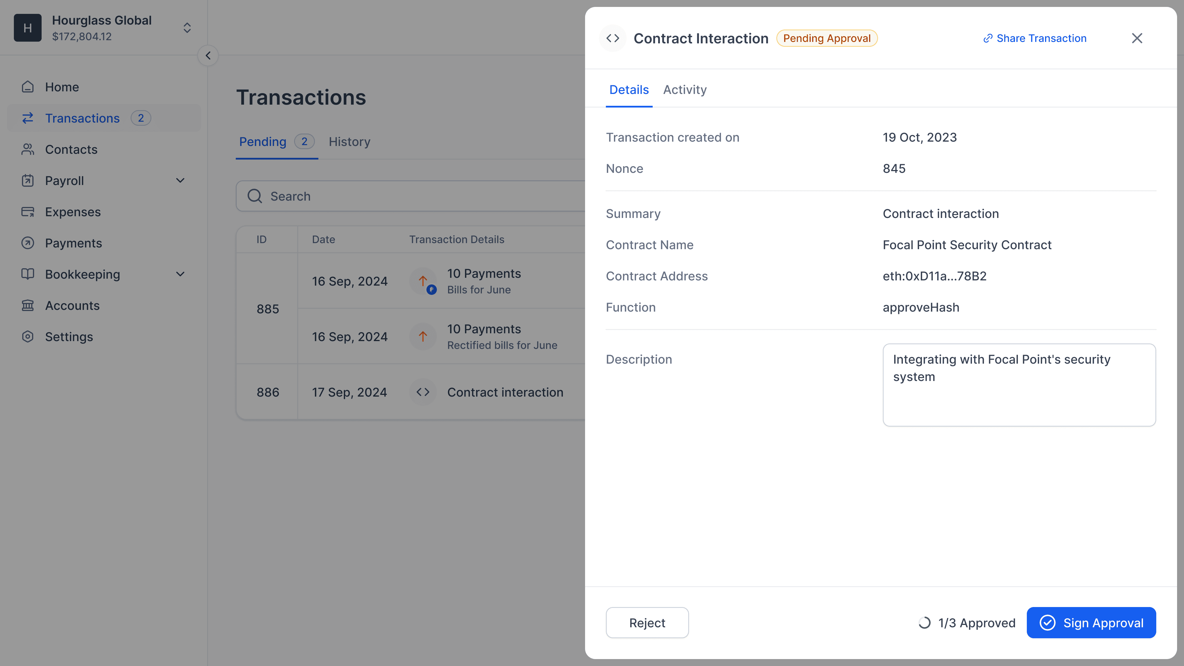
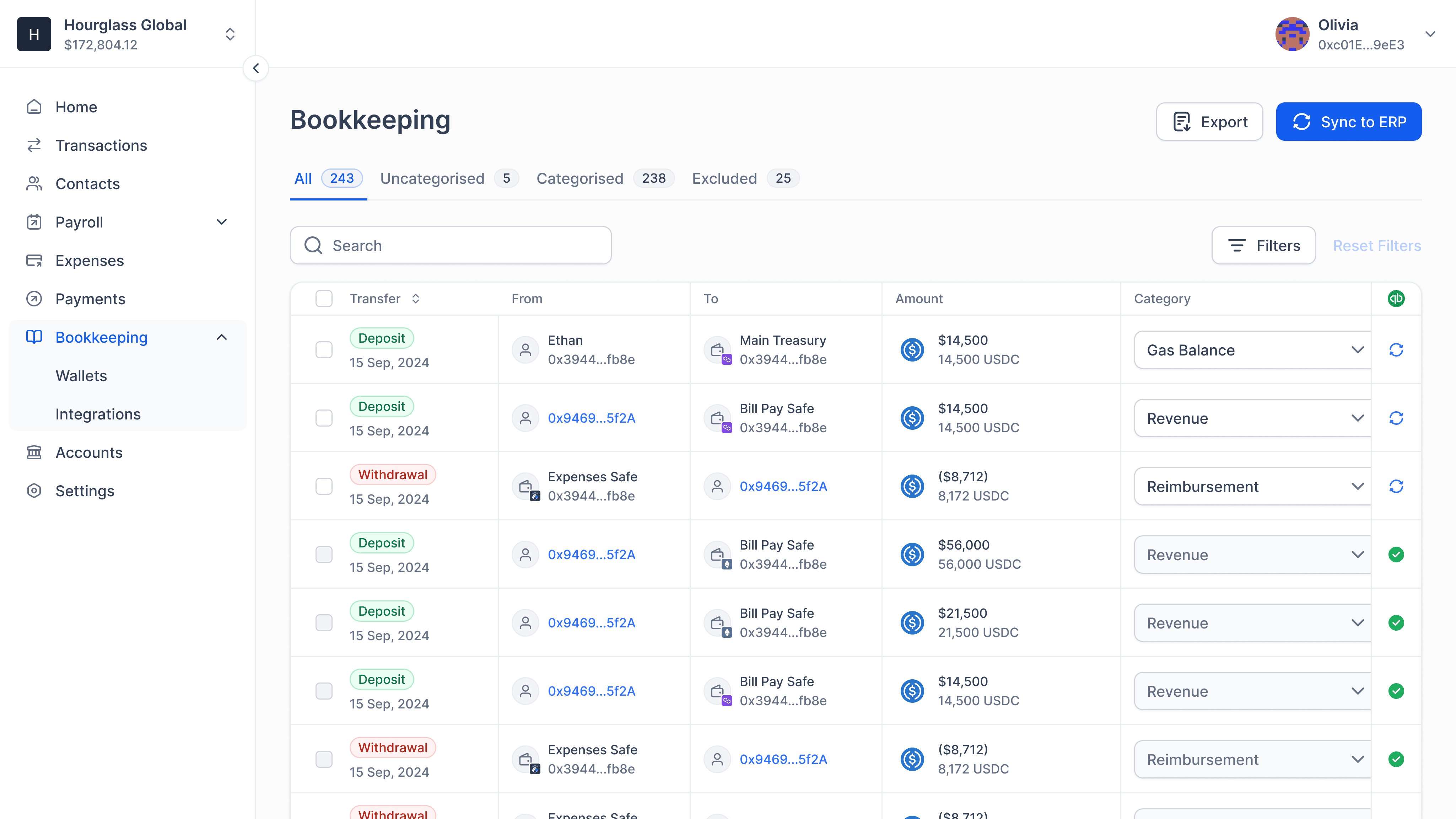
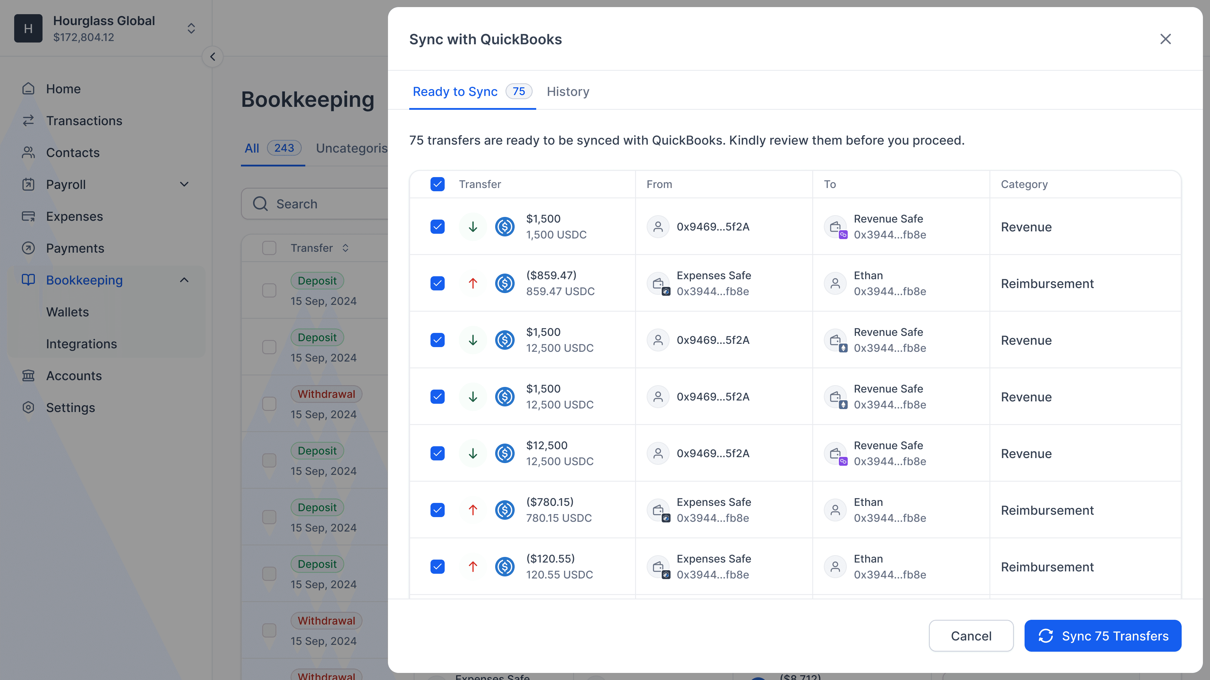
Bookkeeping, the Source of Truth
We built "Bookkeeper" as a role in the app and gave them visibility into every transaction into and out of their SAFE accounts. Transactions that happened through the app had rich and accurate metadata. Users could also push the data to their QuickBooks account.
The Outcome
We build a strong system that allowed both us and our users to grow. We helped our users build healthier financial habits and manage their spends end-to-end within the app. Here are some highlights:
Processed $100m+ in transactions while still in beta.
Reached $50k ARR in a category dominated by free tools.
Improved data accuracy and financial visibility across workflows.
Reduced reliance on external tools for tracking and reconciliation.
Detailing that Wins
We zoomed into every corner of the app that made the experience "ordinary" and recreated patterns until we felt right about them. Here are two examples that users had nice things to say about: