Sneak Peek at Parcel
Overview
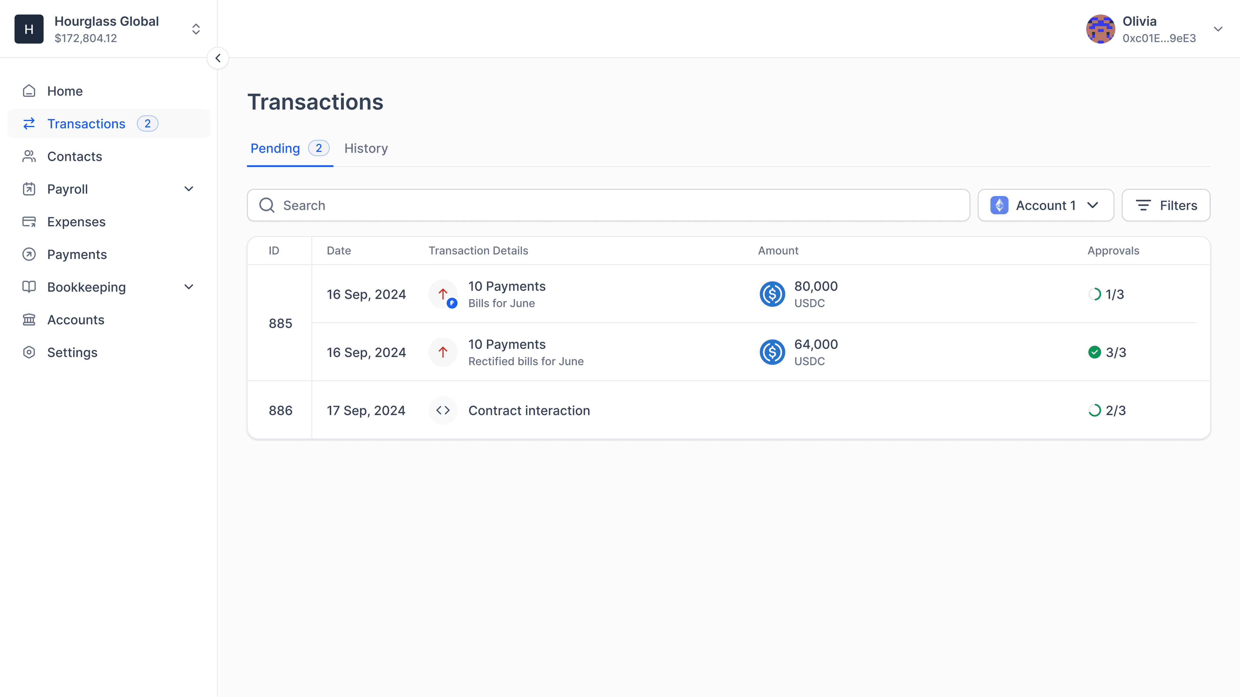
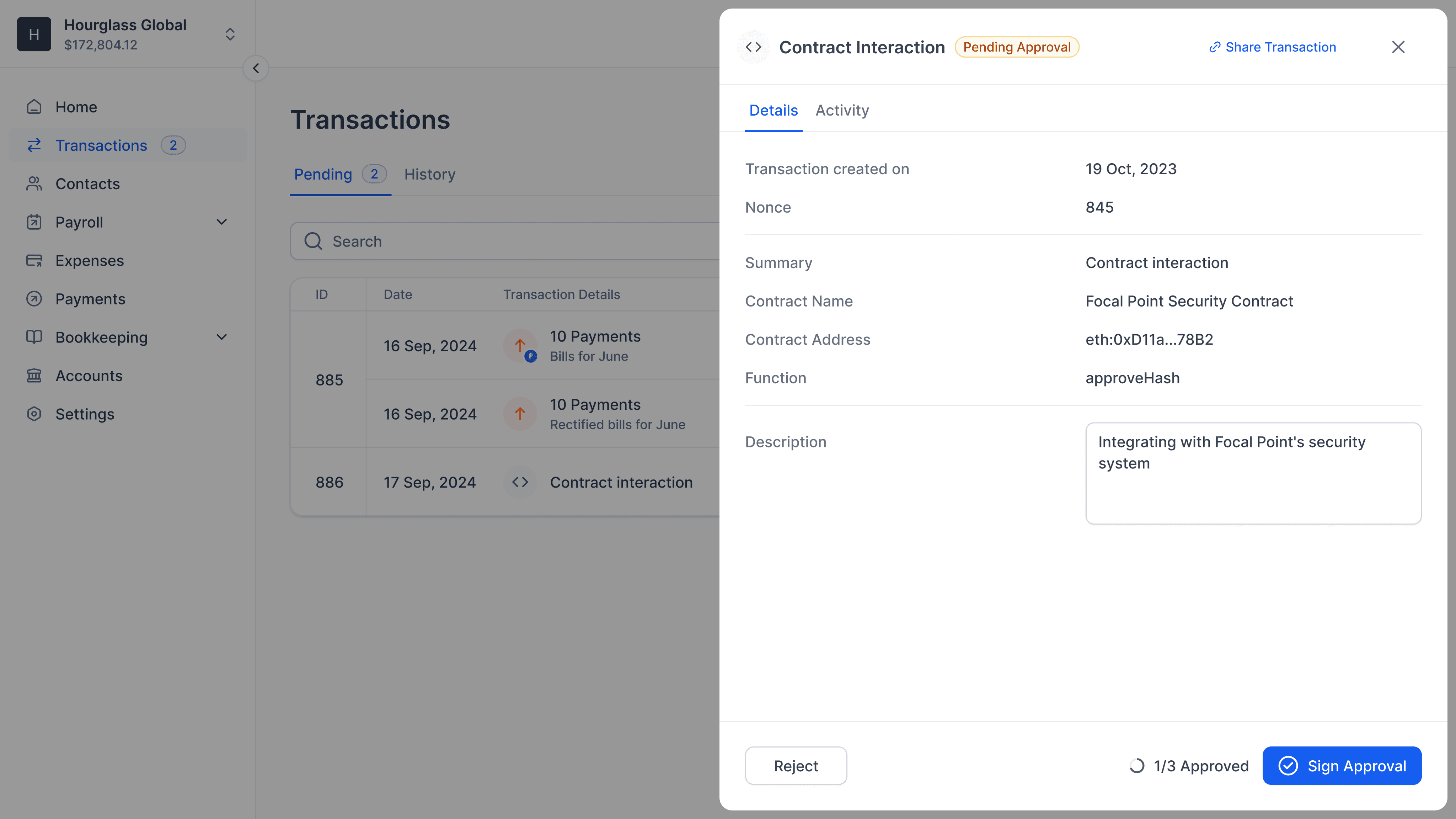
I was leading Parcel’s (parcel.money) design team and primarily worked on our V3 from ground up, a refreshed and opinionated take on crypto payment behaviours. What I’m sharing below are only the main screens to give you an idea of what Parcel looks like. If you want to hear me talk about Parcel in more detail, lets get on a call.
Parcel’s V3
Why did Parcel’s V3 come into existence? What was the V2 like?
Payments was a broken experience in web3. Every app out there, including Parcel's V2, was like a Swiss army knife that you could use for any type of payment. While that sounds amazing and fast, it was a shallow way to design software. Every user had different ways to use the app, some used for payroll, some for bills, and so on. We stepped back and reimagined what the best payments experience would be like, from ground up. While adhering to the vast web of edge cases and restrictions, we built something that shows "How it should be done" rather than what's convenient. This was an important step to clearly position what we offer as a business.
After closely collaborating with our users and rigorous testing, we built a compartmentalised spend management application that's intuitive and clear defines its purpose. Loved and trusted by our users, who processed transactions worth more than $100m while still in beta.
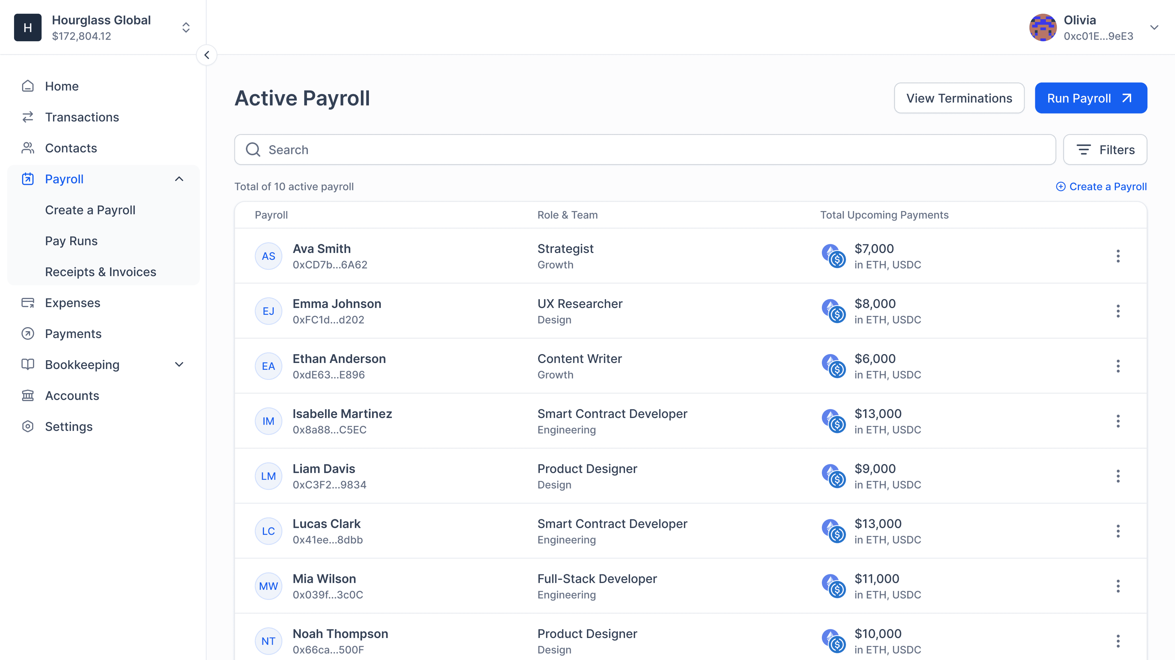
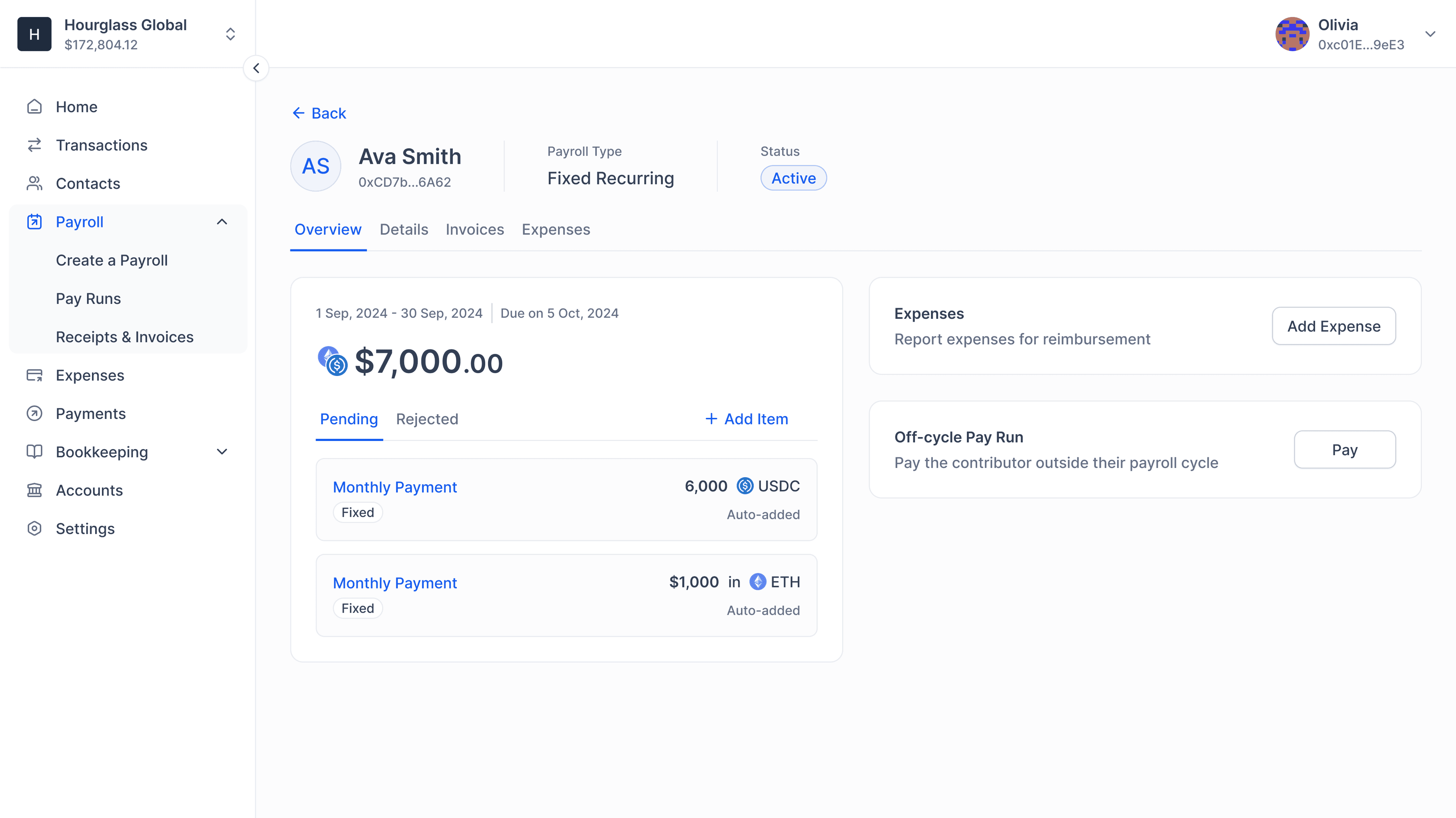
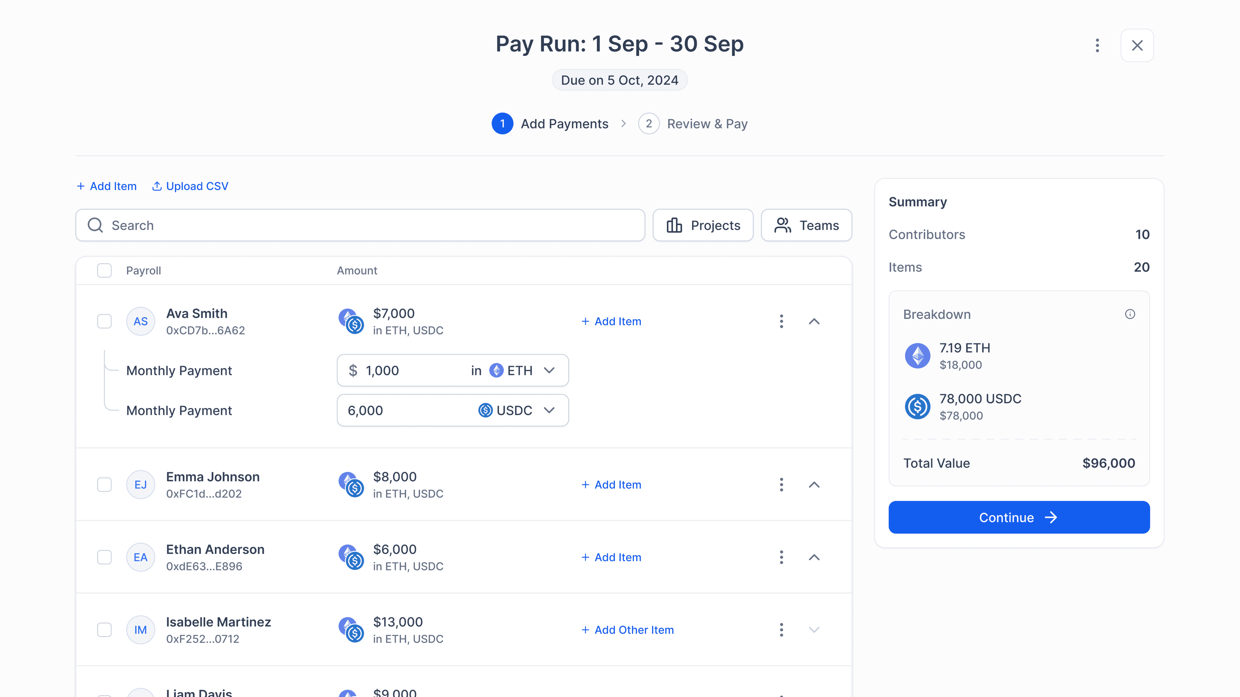
Payroll
A flexible payroll system that supports multi-token payouts, flexible pay cycles, contributor access & more.
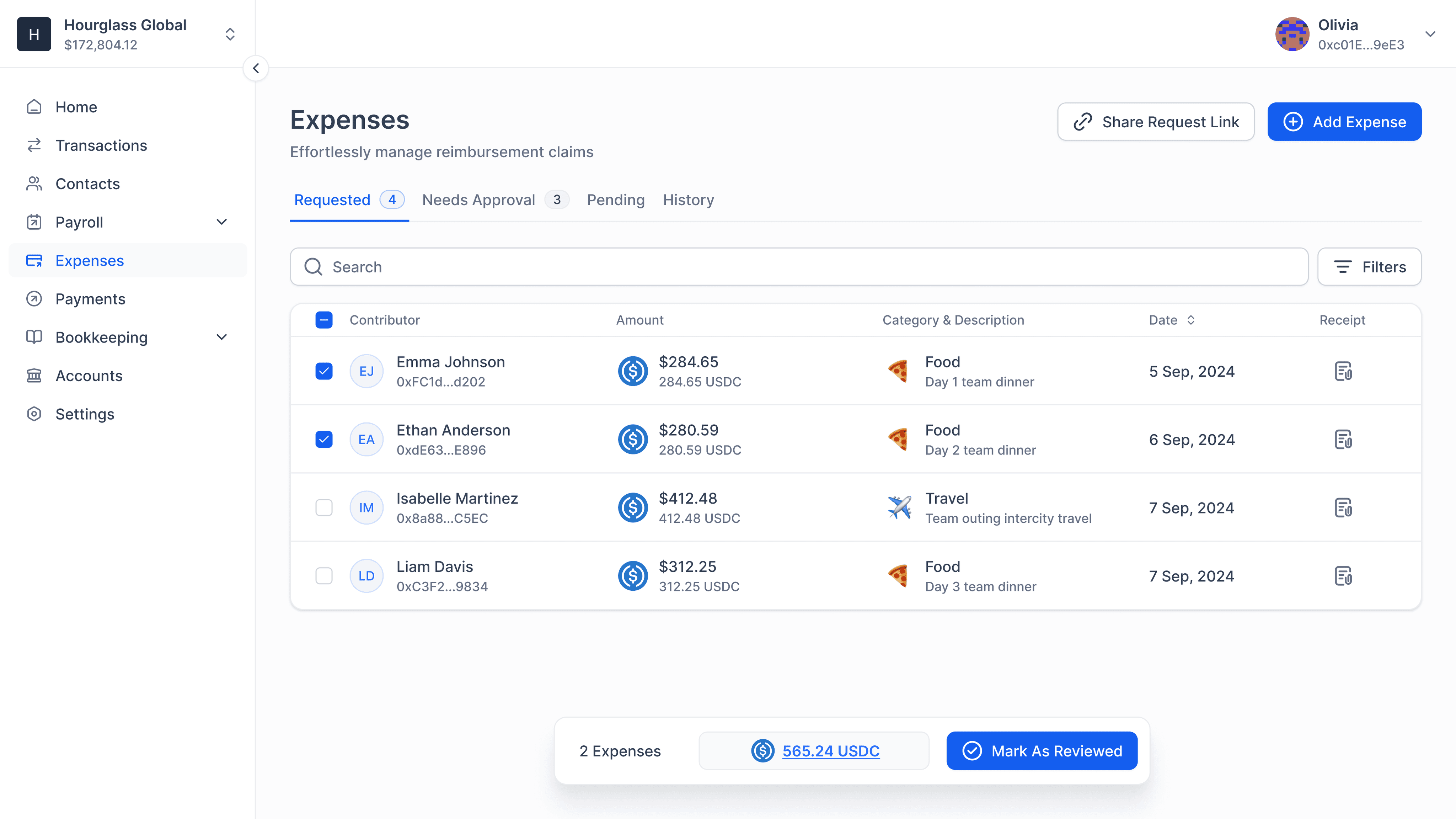
Expenses
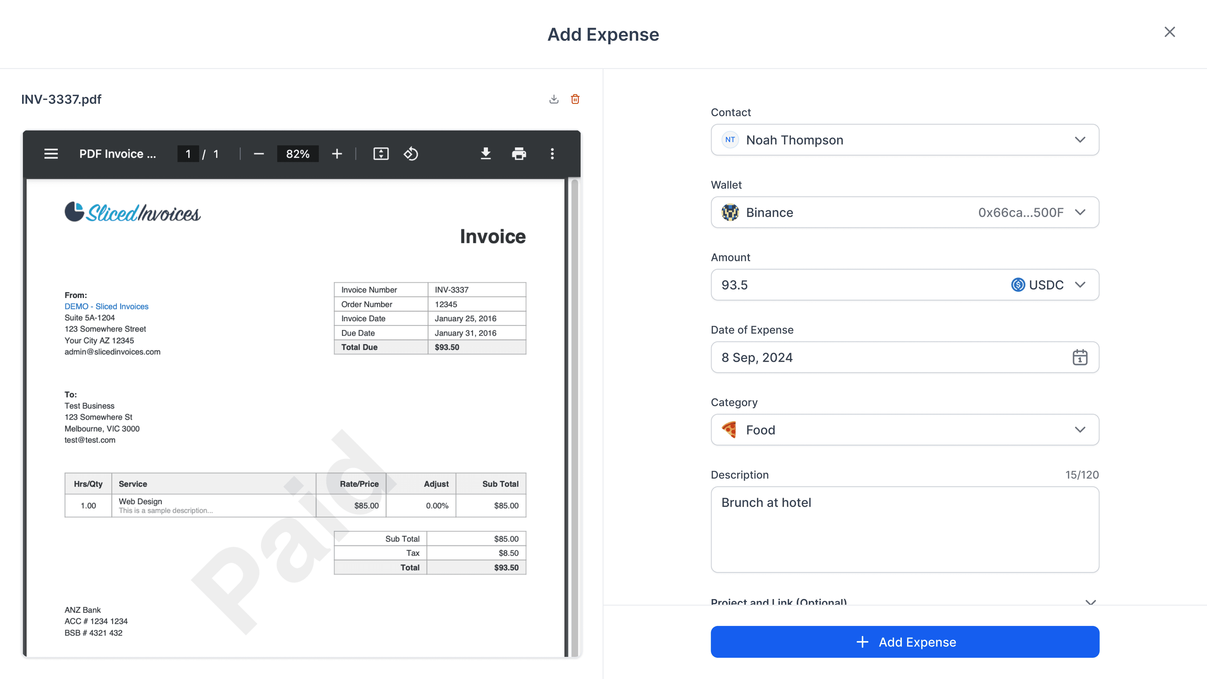
An end-to-end expense management system for both contributors and reviewers.
Payments
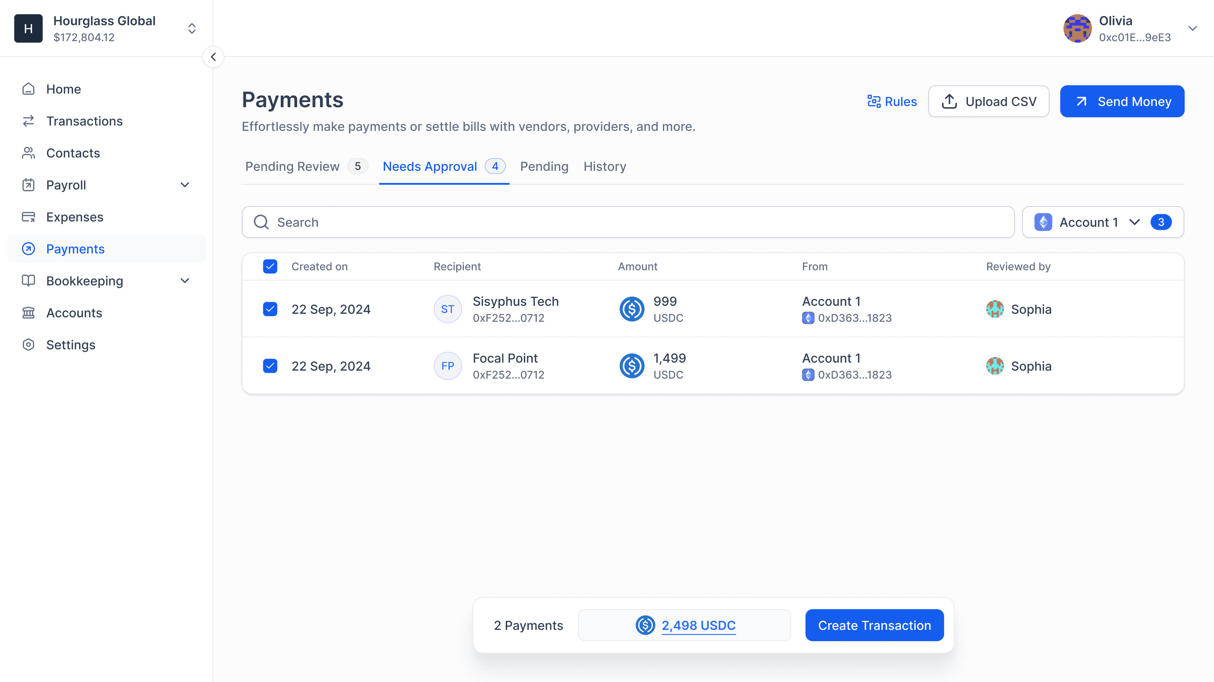
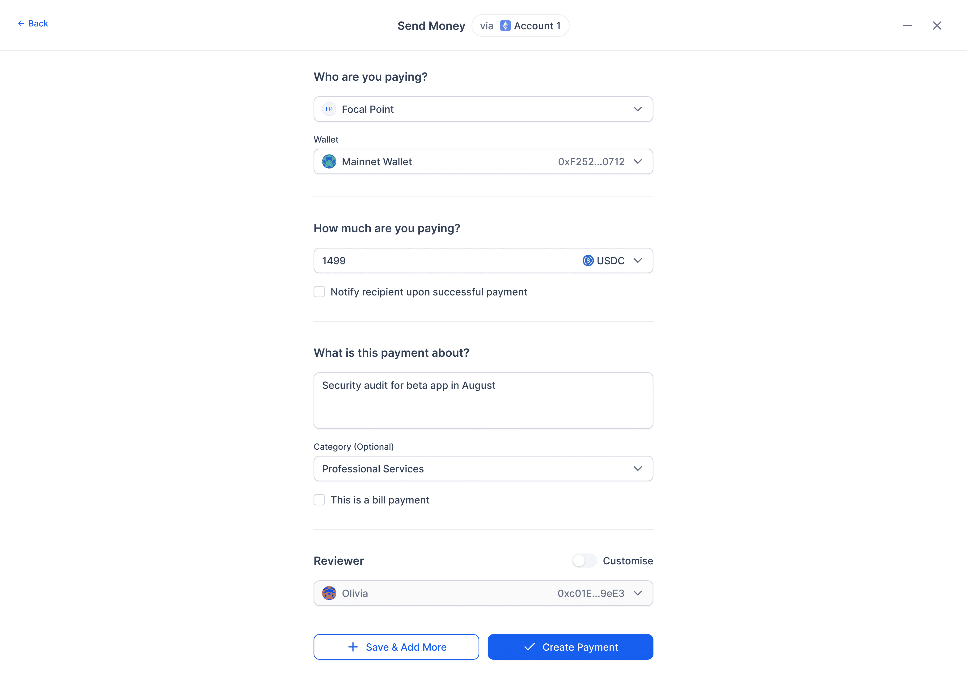
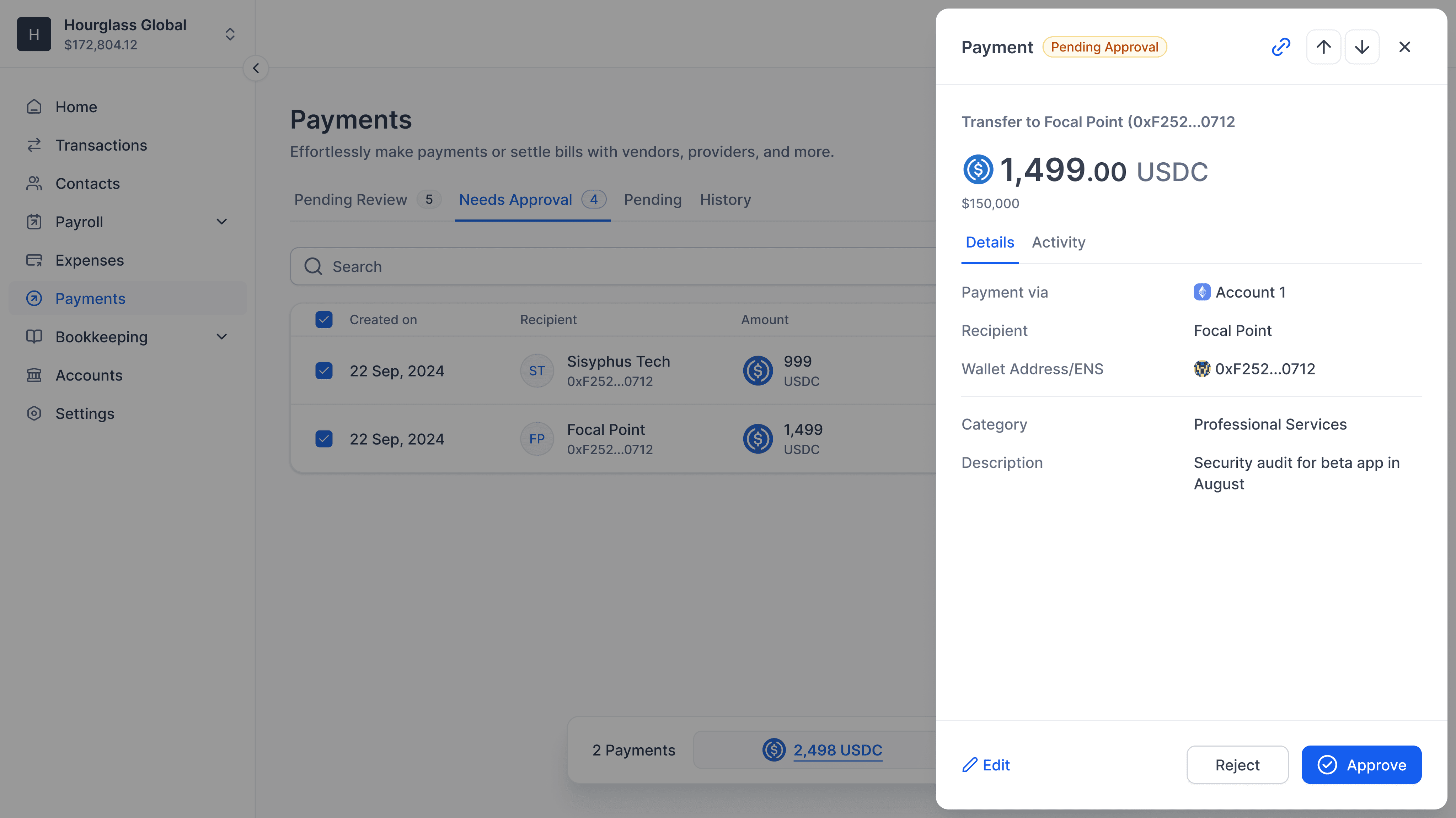
A seamless payments system for the fastest teams.
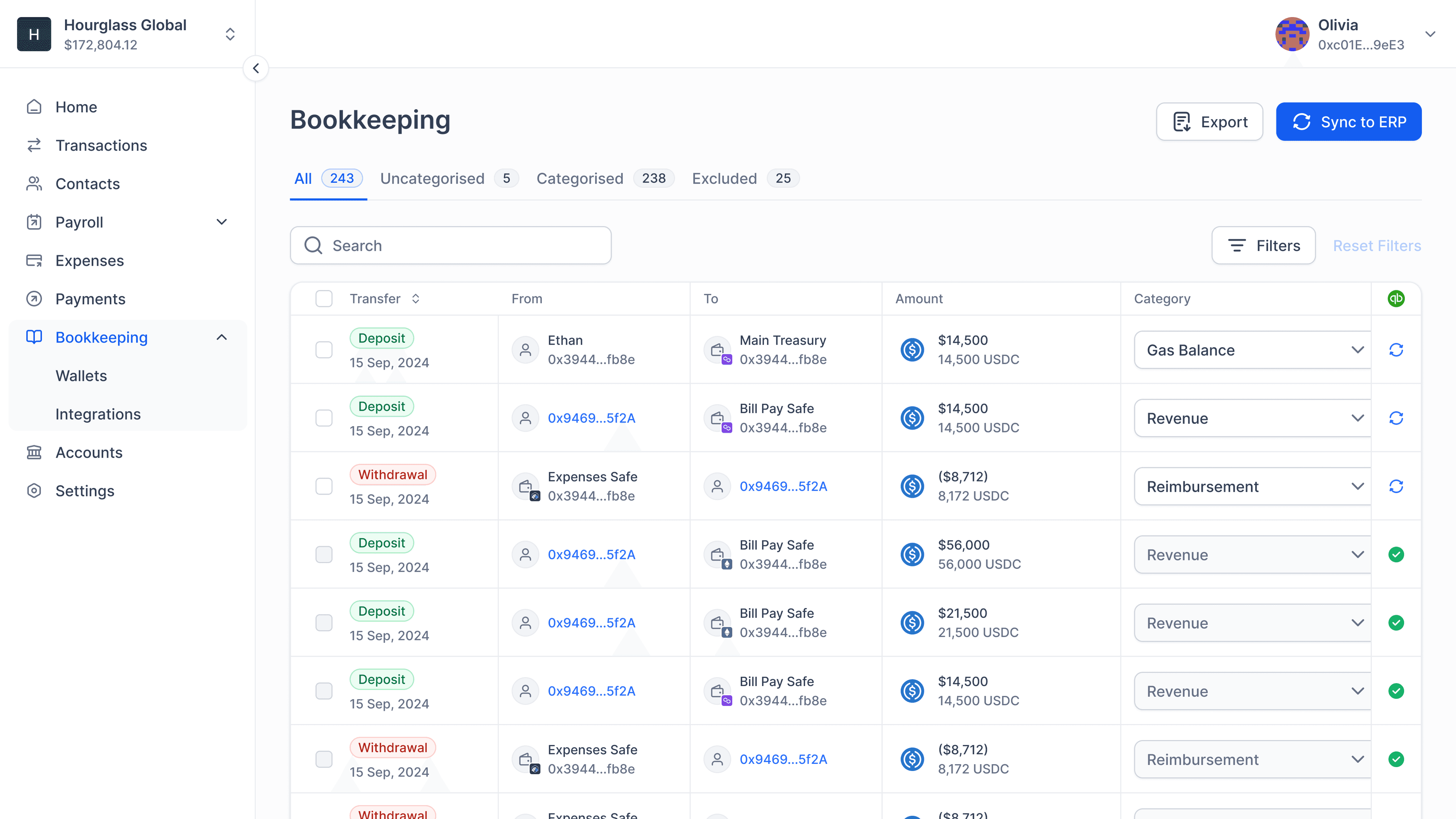
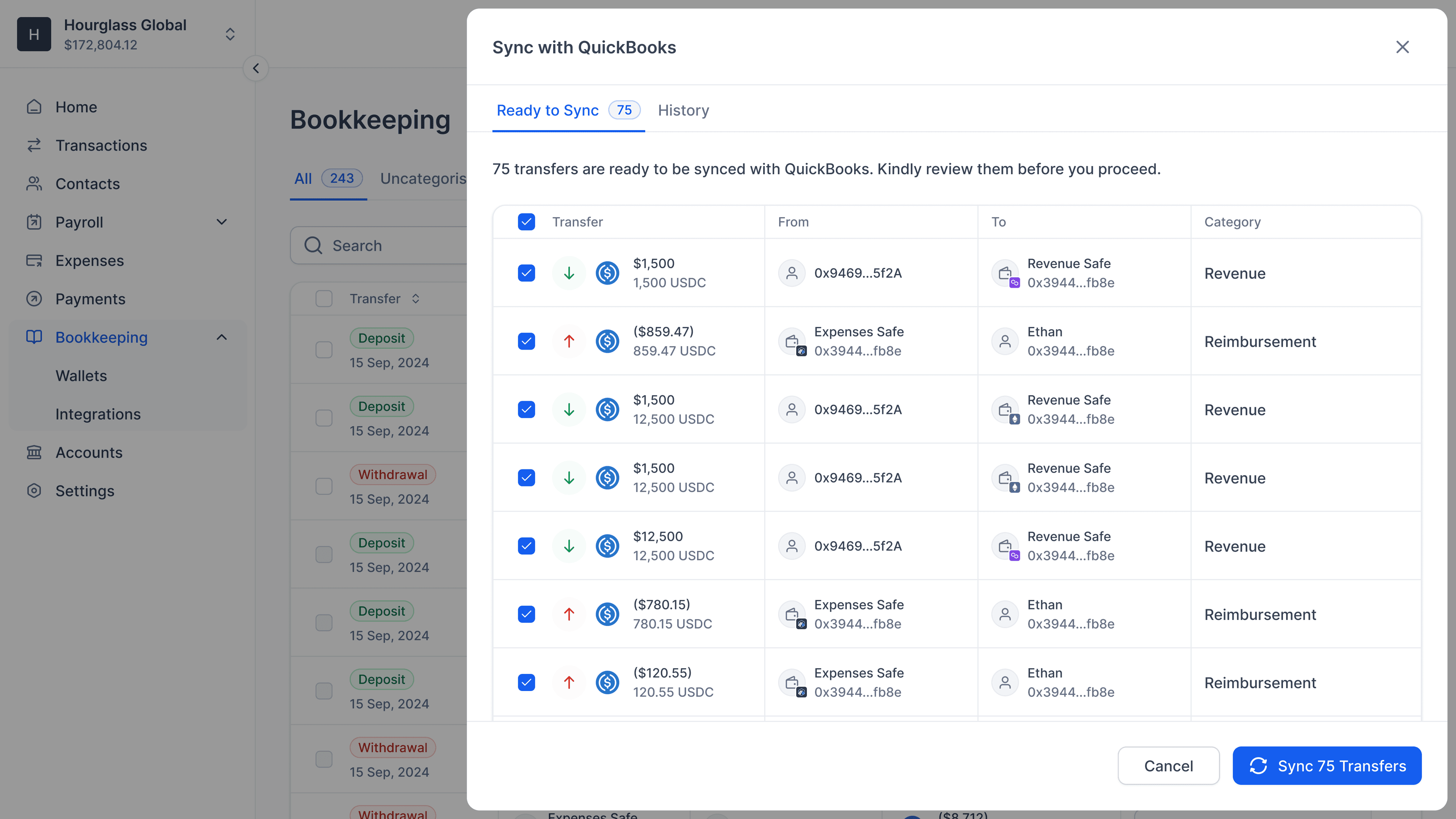
Bookkeeping
A powerful tool to track every cent into and out of safe accounts. This made the app holistic and created an ecosystem for finance teams.
Special Mentions
In this grand nest of workflows and features, there were two tiny things that I have a soft spot for. Something that most other apps get wrong and the fixes I’m so proud of.
The address input field in most apps is underwhelming. The ENS doesn't reveal the underlying address, or just lazily have it as a supporting text in the next line, or worse, the underlying address replaces the user's ENS input.
A lot of apps check for errors post user's action and do not have meaningful messages when dealing with multiple errors. Some don't even show you the total before making a transaction.
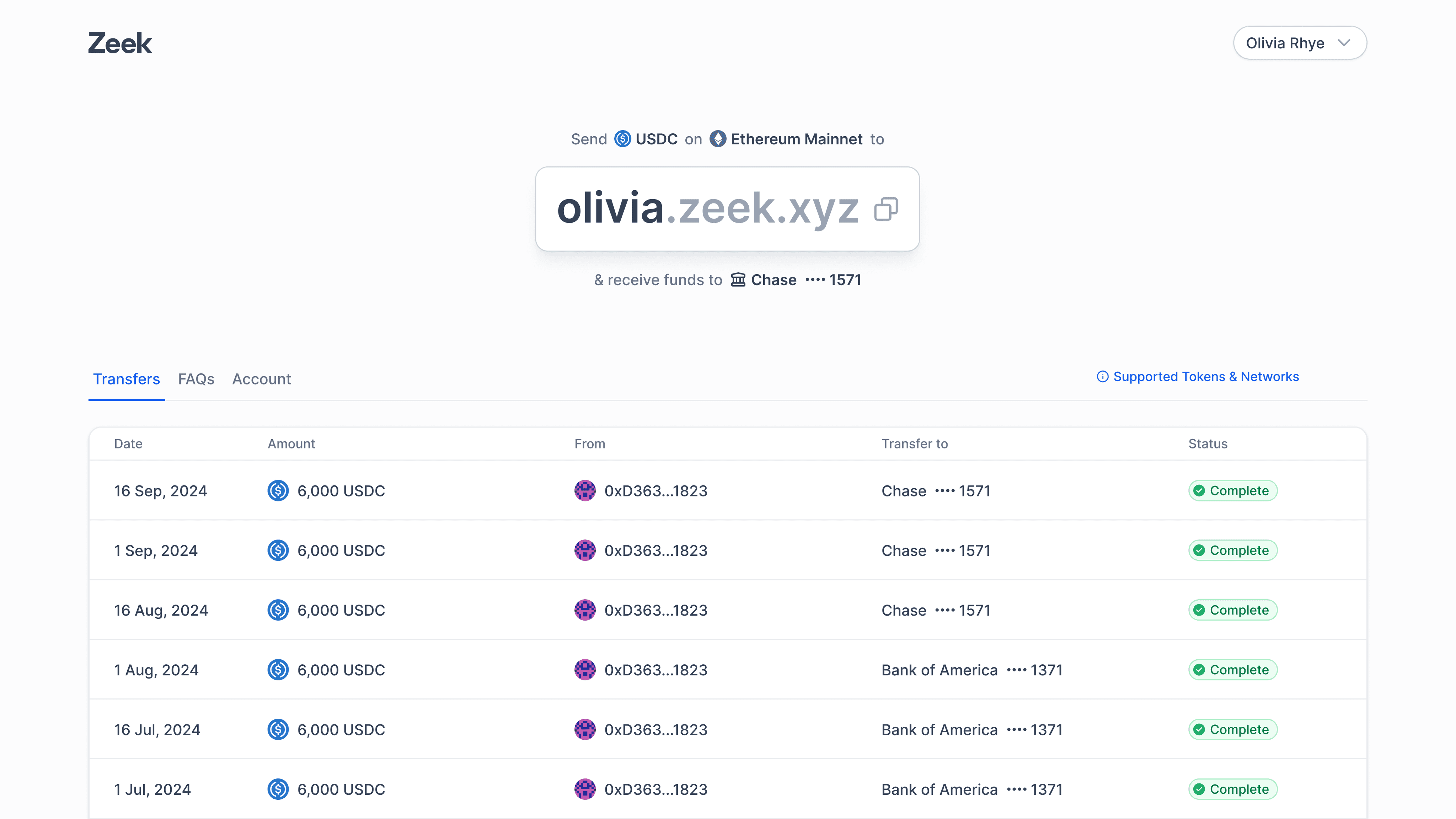
Zeek
We’ve also built an app that simplifies crypto to cash conversions to a one-time setup.
Unreleased Work
We kept looking for gaps to fill in the crypto space but some of them remained behind the curtains.
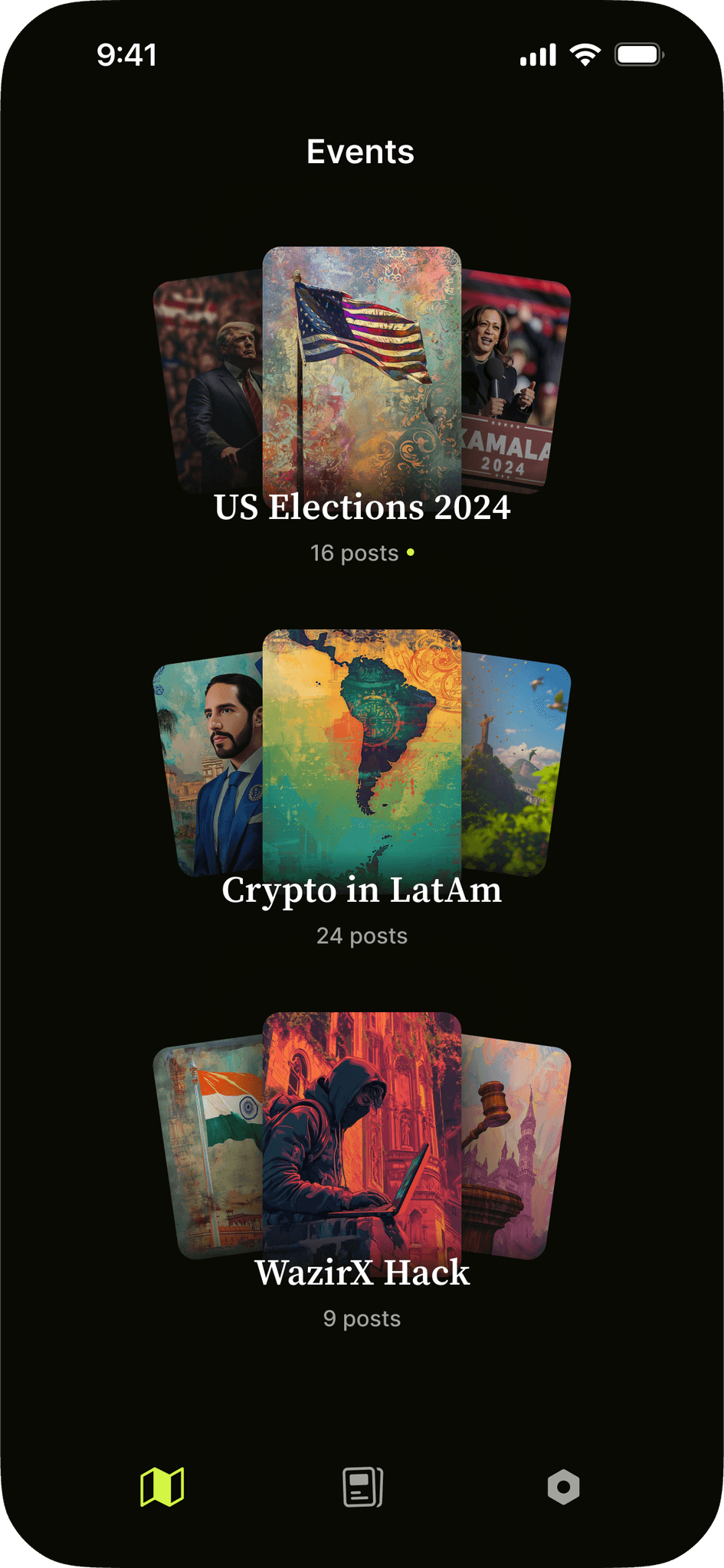
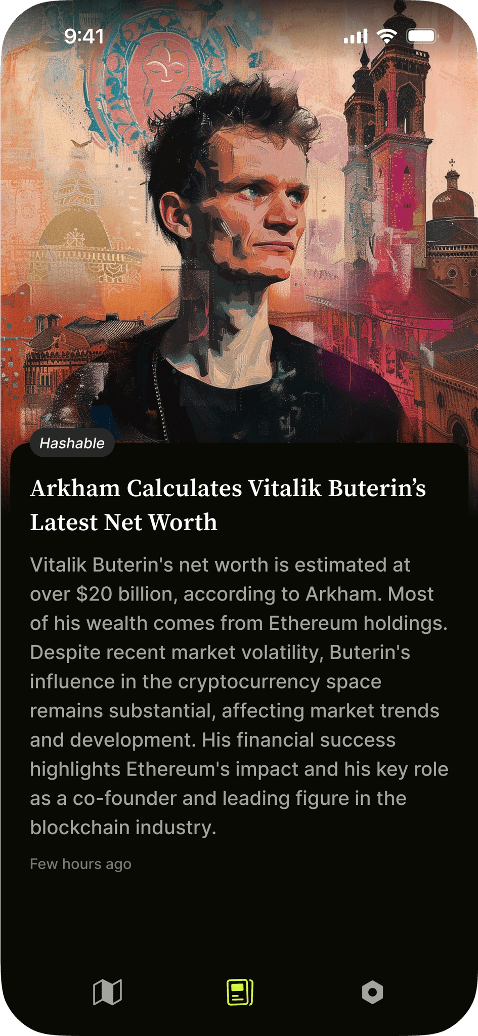
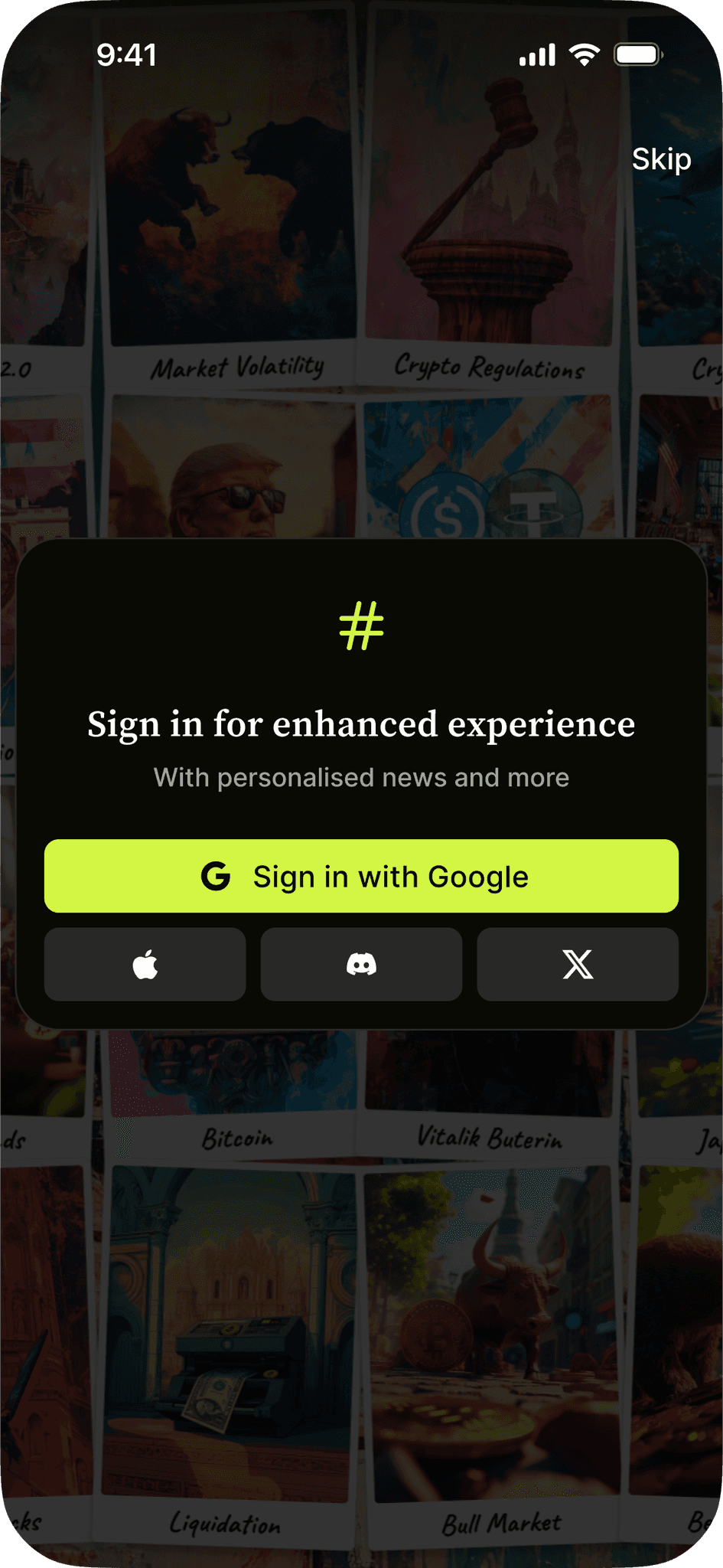
Hashable
Hashable was a crypto-focused news application. I worked on the app design, curated and summarised news, and setup the prompt guidelines for image generation on midjourney.
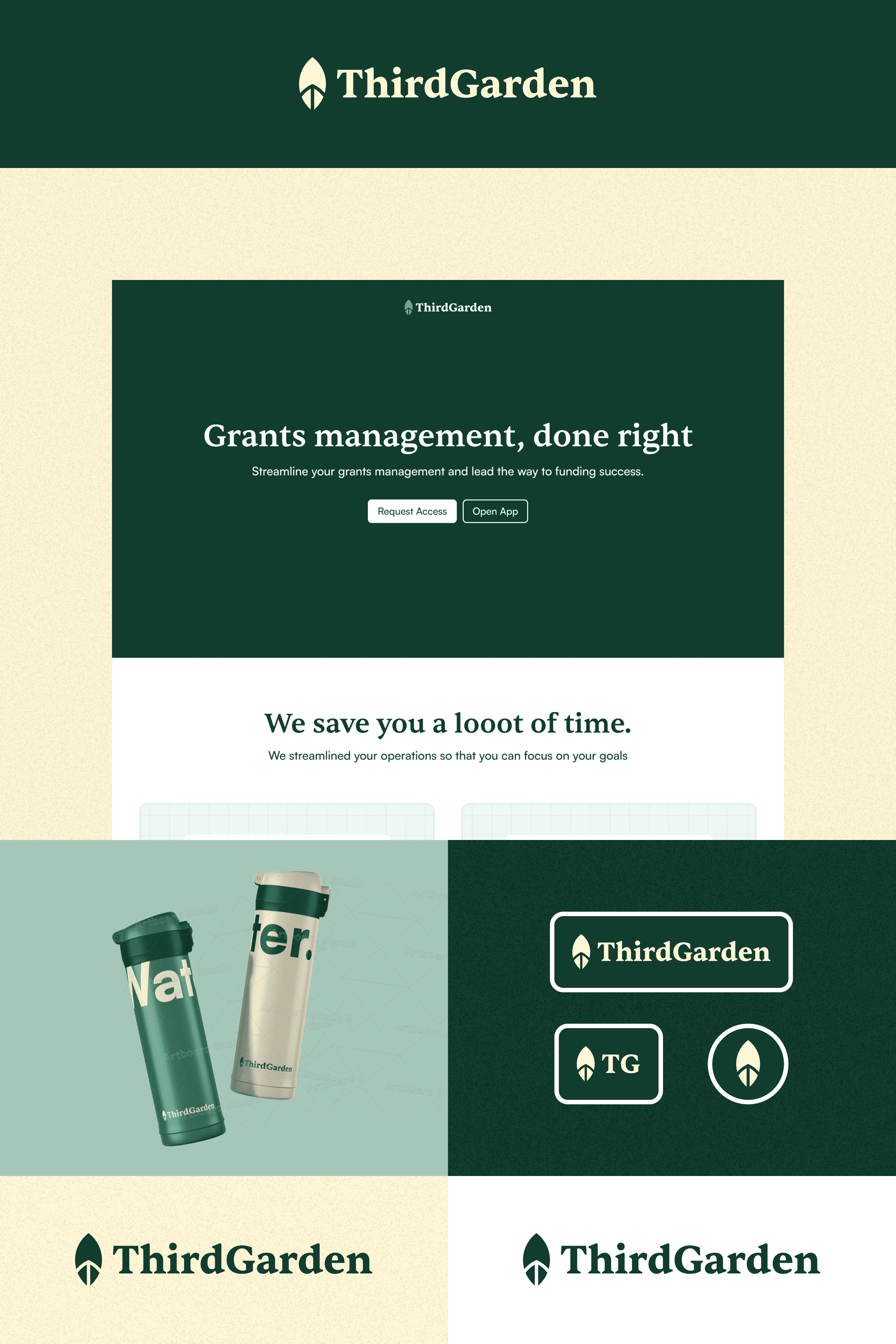
ThirdGarden
ThirdGarden was a grants management application. I worked on its logo design and tinkered with brand experiments.
